Monday, 29 November 2010

Compare CD Cover iconography

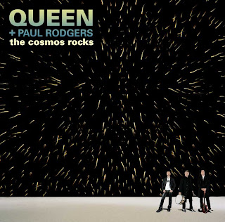
Out of the 3 I just analysed I feel that the Linkin Park and Queen + Paul Rogers albums are the most similar but have many comparisons in target audience and iconography. Even though they are of the same genre one has a wider range of target audience than the other. For example the Queen album holds more of a target audience but this is because they have a lot more fans as they are more famous and have been going on for longer, therefore they have more people to impress and please with there iconography.
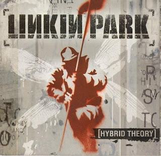
However, I feel that their iconography isn't as good as Linkin Park's CD covers iconography. This is because Queen's album cover is simple as it just hold a small image of the band and the bands name. But Linkin Park's album cover has an image that symbolises their music and shows rock in a different way.
A stereotype of rock is all the dark side for example death images, strange skulls and evil. And Linkin Park's album cover holds bits of this stereotype. For example they have an army man looking like he has come back from battle whilst having wings with some disfigurement to show its not all good. They also have some dripping images which is sometimes symbolised as blood in the rock genre, but I think this is clever how Linkin Park have used a white colour for these drips on the wings to maybe show a different type of blood and misery.
Overall I believe that the Linkin Park's album cover would appeal more to me as their iconography shows more of what the band are about and what their music would be like, whereas the Queen's album cover shows their iconography as it just shows an image of the band holding their instruments but not really showing me what the music is about and like. On the other hand for this Queen album, old fans will already know what the music is like and will buy this just for the sake of a new album from the well known band.

I have learnt from the Linkin Park's that I could show what the bands music is like by using a symbolic image and interpreting stereotypes of the rock genre in it, for example using dipped writing or the masks with a smudge etc. I will definitely consider using this technique.

CD Covers

1. Linkin Park - Hybrid Theory
This genre of music is rock/alternative rock and I believe the target audience is 16+. This is because I believe they are targeted by the images shown for example there is an army soldier holding a flag showing battle but at the same time having wings which could symbolise anything from an angel to a butterfly, even a fly. This could link with people who have been in the army and possibly people who have come back as heroes. i.e. the wings.
The colour scheme is dark colours showing a strong link to rock music. It also has the band logo and album name in the same font to keep the things similar and looking neat, however they have made it look like its a messy stamp that could be smudged etc. This could count for the whole image as the soldier is faint and the wings are smudged and dripping as if it has just been painted and left. This promotes the band as it gives a powerful thought about their music and the roughness of image shows they are a band of mischief and rebellious.

2. Queen + Paul Rogers - The Cosmos Rocks
This genre is once again rock and the target audience is a very wide age range as the band have been round for many years and are very famous, therefore the target audience is round 20-60. They are targeted by the band releasing a new album with another lead singer and also they show the instruments on the CD cover. This gives the audience on the type of music the band creates. The album also has the word 'rock' in the title, therefore allows the audience who enjoy rock know that this album may hold a lot of it.
The iconography is used well to promote the artist as it shows an image of the band with an effective star / explosion image. This shows that the band may have great music which creates an explosion in the fans ipod playlist or CD cupboard. It also shows the bands name so the audience know who's album it is and what past fans will know what the music will be like or what they will be expecting from them.

3. Scissor Sisters - Ta Dah
This genre of music is pop and their target audience is mainly homosexuals but an age range of 16+. They target this audience by making their album cover look like a man is revealing the real him, which is one message from the band which is 'proud to be gay'. This will encourage homosexuals to buy the album. Also, for the different age ranges the image on the cover also has many people in the lift of different gender and age, therefore they may be telling the audience that their music is for everyone.
The iconography of the album cover is that they have used the bands logo in the image of the lift. This is clever as it shows previous fans that just because their is a new alum, doesn't mean the music is any different and the band are still entertaining with a new theme. They have also used good colour scheme as the lift and room seem plan but what all the characters in the lift are wearing, it shows a variety of colours and clothing which really symbolises what the band are really like.

Wednesday, 24 November 2010

Filming Day 2

We completed our filming today as we finished with our main actor who was in year 7. We managed to film the toilet scene and the escape scene alongside a teacher for him to chase after the rebel while he escapes. This was successful but the most challenging thing about filming today was trying to keep the continuity, for example the rebel had his sleeves and collar up and we needed to make sure they stayed this way for the rest of the video.
All the other filming shots were successful and should create a great ending to our video.
We need to now concentrate on editing our final piece which we are really looking forward to.

Sunday, 21 November 2010

Filming Day 1

Me and my group had organised to use a year 7 class for our army of children for an hours work. This was successful for the amount of filming we needed them for but felt like a rush as we were non stop working. We firstly needed them to understand that this was our coursework and any misbehaving would waste precious time and wouldn't be fair on us. We also had our teacher there for supervision so all children would be under control. Saying this when we started the shooting we noticed that they were all well behaved and we had no trouble at all.

We then had to discuss about the main part which was a young boy who stood out to us as a rebel. In the end we picked a young boy with a moheekan as a hair style and we felt that this boy fitted the part without even trying. We therefore presented him with the gold mask and everyone else with the silver mask.

Our first shots were of all the children marching down main street. We got different shots and angles of this and they did this very well by all using the same feet and all moving at the same time. It really began to look like an army of school kids which was our main aim. Whilst doing the marching shots we discovered that we didn't have the white shoes needed for the rebel, therefore we left this and concentrated on all the children's feet marching and did good shots of them turning at the same time which looked effective. Another reason why we felt that the white shoes could be left out was because we believed that the shot where the rebel leans out of the line is an effective one and we felt that this would be the first time we notice the boy and the most powerful shot.
One thing me and my group worried about was if we had enough footage for us to use of them marching but as we only had half an hour left to do the classroom scene we needed to move on. We decided to book the class to do any more filming if it was needed.

We then took them upstairs to do the classroom scene where the rebel notices that all the children are writing the same then he goes over the top, for example we made him scribble over his writing, stand up, push his chair over and storm out. This worked well as all the children still wearing the masks were all writing the same thing at the same time. This was 'All work and no play makes John a dull boy' over and over again. They also co operated while we concentrated on the rebels shots of him storming out.

We then realised that we needed the children to shoot the escape scene for the end of the video, but had little time for us to actually do this, therefore we changed the story slightly - we thought the rebel could get into the office and use the tannoy, this way we could film the rest of the class still in the classroom look up as if they hear the tannoy and then all of a sudden run out. We also thought this would be effective to use subtitles to show the viewers what the rebel was saying to the rest of the school.

With minutes left of filming we took effective shots of all the children in the corridor all cheering and messing about with their masks whilst the rebel stood still staring at the camera whilst holding the mask. This shot worked incredibly well as we got different types of shots, from extreme close ups to mid shots. It showed that the rebel had got the rest of the students on his side and he was the leader of the alliance. We will definitely use them shots in the video, even if it means changing the ending slightly.

After the children went back to their class we had another hour to shoot our CCTV footage around school. We got shots of corridors with no one in them. We also wanted to make sure that no windows were visible so none of the outside world was shown. We also got a shot of a corridor where a door is just left swinging, this showed that the school was empty and possibly deserted. This looks like a good start to the video as it fits with the beginning music but once the singing and heavy music begins is when we see the children beginning to march.

Our next filming day we will need our lead boy to do the toilet scene and the escape scene. This should only take about two hours, but we need to organise getting the lead out of his lesson or organise a time after school.

Thursday, 18 November 2010

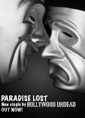
Paradise Lost Advert For Webpage

Here is my advert for our music video and it will be on my web page to advertise the song, it also creates band identity. I used a creative image of the masks as we use the sad and happy masks in the video so it advertises what will be in the video and what the fans can expect to see. I had to make it lack and white however as the colours of the masks were wrong with the smile mask being gold and the sad being silver whereas in our video it is the opposite way round. However, I do find the black and white to be effective as our video will also be in black and white except for the gold mask but it will give a sense of mystery when the fans see the video and link it back with this image.

Thursday, 11 November 2010

What we need...

  • 30 students / year 7 that are well behaved and easy to control.
  • We also need 1 student who is preferably a boy to play the rebel, he will be needed for all shooting.
  • Entry to an empty classroom and boys toilets.
  • 2-3 teachers for most of the filming, either gender.
  • 30 masks, 29 in one colour and 1 in another. (29 of the comedy masks, 1 of the tragedy mask)
With all of these our filming should be successful.

Shooting Schedule

If we don't have the masks by Wednesday:
  • Shoot the CCTV shots of the building. This will be needed to do without any person in shot.
If we do have the masks be Wednesday:
  • We do all the marching shots with the kids, all shots where they are moving in main street e.g. the shoes, the rebel looking round the queue etc. We will have to do these shots during lesson time so no disturbance will occur.
  • Shoot the classroom shots where all the students are working then the rebel runs out. This will involve the whole cast as well as the marching will. This will require an empty classroom which won't be interfered with during shooting.
  • We will then do the escape scene which will also involve the whole cast including teachers. This will require some outside work therefore the weather will need to be right - sunny, not wet.
  • Then we will do the toilet scene with the rebel boy. This will not take long but is an important part of the video.
  • We then will shoot important shots such as the CCTV or certain shots of the teachers e.g. one walking on the bridge.
This shooting schedule can be spread out over two days but the same cast would be preferred in order of them knowing what they were doing and how to act the part etc. If this isn's possible then it isn't a major problem as most of the cast are wearing masks so no one will know we haven't used the same people. The rebel will have to be the same as his identity is shown and to keep with continuity he has to stay the same.

Wednesday, 10 November 2010

Model Release Form

Our production; Bucket Head Productions have made model release forms for the students that will be in the video to sign so we have permission to use them. This is important because some students may not want to be in the video and it also reassures and notifies the schools and parents that they will be in the music video and will be used in a piece of coursework.
However, we realised that most of the students in the group will have masks on, therefore their identity will be hidden. This made us think that we don't necessarily need their permission, but we fill that we need to be on the safe side anyway as they are children and the main character takes his mask off so his face will be shown so his permission will be needed.

Masks for Video

Me and my group where research the masks to buy for our music video. Firstly we had the idea of blurring the face of the students so all attention would be on the rebel, however we noticed this wouldn't be possible as we don't have the correct technical resources to do so. In conclusion we decided to use the masks.
We wanted to have masks to show the students marching were like robots and all similar, however the rebel would have, throughout the video, become different and stood out.
We therefore looked for masks on ebay and found plain white masks which covered all of the face.

This way all the students would where the same masks including the rebel to show equality. However, when ordering we discovered comedy and tragedy masks which we believed to be a better idea. All the students would where the comedy masks which had huge smiles on, whilst the tragedy mask would be worn by the rebel which had a sad face on it. This showed the difference between the two. Also, they were different colours, the tragedy mask was gold whilst the comedy mask was silver. This gave use the opportunity to use chroma key. This would allow us to make the rebel stand out even more and make it more noticable.


Monday, 8 November 2010

Blog Update: Web Page Convention

How have you used web page conventions to create brand identity?

I have used many web conventions to keep my bands identity, for example I have kept a good layout which provides colours that the band and genre would use - red, black and white. I have also included images such as the American flag in this layout as it represents their country and shows its important to the band and we know this because they have used it for one of their album covers recently. I have also chosen to use the flag in an effective way for the banner as I have mixed the band with the flag. This shows the band representing the country and being proud to be apart of the USA.
The text I have used is to let the audience know the latest news of the band and have a forum for them to join in. This has the bands identity written in it, as the news is about them and in the forum fans talk about how good the band is and what they enjoy about them.
I have kept the fonts the same for each section as it makes the website look more organised and it helps the viewers know what to look at and easier to understand what is what.

Wednesday, 3 November 2010

Final Video Idea

Me and my group have decided to have a narrative video. This is because we have come up with a good idea which involves a rebellious streak from a child. In the video it begins in a school which looks like it is filled with robots as we have decided to make the kids wear masks that match. This links with the bands recent videos and gives a sense of mystery to the story line. There will be teachers who look like the leader. It creates a society where all the kids are equal and perfect. However we are going to have a rebellious kid. For example they will be marching at the beginning and they will all have black shoes except for the rebel who will have white trainers. This will show his differences. The story goes along with the kid realising something is wrong and becomes more 'out of the pack'. We thought of ideas such as CCTV's over the school which will not only give us a good opening of the school but it will also be used to catch the boy scruffing his look creating a better rebellion look. This will cause more trouble and leads us to the big climax which is him taking the mask off. We thought for the ending that he will escape from the building and encourage others to do the same but once freed they realise that it was best for them to stay in their as they will 'burn' on the outside.
We still need to develop this idea but it looks like a good start and I look forward to the production of it.

Moodboard for Video

Mood Board

Tuesday, 2 November 2010

Banner Ideas & Progress


For my banner I had two good ideas which I am struggling to decide on what to use.
Firstly I decided on having the Hollywood sign on my banner with a slight defect, this defect would have been that half of the sign was collapsing. This was meant to show that even though the band respects that area as they have decided to have it apart of their name, they are still rebels to the world as you only have to hear their music to discover, therefore with the falling sign it shows not all is good. The 'Undead' part would have been with a scripted font to show graceness with also a twist. Yes, it would have had nice neat writting, but I would have made it look like it was written in blood. The bands name would have been designed graphically and dark looking but this would have suited the bands music and genre and the fans may be expecting it anyway and may even like it. Also on this banner I would have incuded an image of a dove grasping hold of a grenade. This image is already represented for the band, however I would have made it look more realistic whereas the one the band already use is a cartoon image like the one shown above. This banner would have included dark colours and a faint dark background to represent the dark places of America and how this band is brought across.
The second idea I prefer slightly as it includes an American flag. This american flag would be behind the bands title which I would do similar to the first idea but not so threaten looking. For example I would do the 'Hollywood Undead' without the Hollywood sign falling down and the Undead looking like blood, instead keep the fonts the same but normal. However, this alone doesn't show the bands real side to them, therefore I would add in bullet holes around the bands name and some in the American flag. This I believe is a strong message as the American flag has been shot but is still flying, showing that the band are a strong unit and feel passionate for their country which may reflect in their music. It also shows that America may not be a perfect country but is still a powerful one, just like the band want to be recognised.
Overall I believe that the second idea may be the one I choose as I think the message is a strong one to give to fans and it makes the band look extremely powerful, therefore giving off a powerful sense of music.

In the end for my banner I create a new image completely, I wanted to merge the band with the american flag which I did so on gimp. I wanted to do this to show the bands relations to the country and how close they are to it. I changed some of the colours to make it look more effective then added the bands name as a title. Overall I am very happy with the logo I produced.

Monday, 1 November 2010

Blog Update: Logo

My logo production is that I used colours that will link with not only the band but also the genre of the music, but how i did so was i used paint software to create the image and used a website called picnik.com. These softwares allowed me to get the correct image which i had in mind and happy with my finished logo.
For example I used picnik.com to create the correct colours so they matched the same stereotypes as the genre which is dark reds, black and white. This will tell the fans that this company produces the videos for this type of music. I also used original font as i felt it wasn't as symbolic and important as the image because the image needs to be noticed to see the similarity to the band for example the masks and hidden identity.
It represents my company in a good way as they also have a hidden identity as the Hollywood Undead does as they wear masks. This shows that the company likes this sort of music and creates the videos for this music therefore the fans will know and remember because of the image what sort of music we do.
The next step will be to produce my banner and in order to do so I will need to use a software called gimp, with this software it will allow me to create a banner with good effects and relate to my bands style. For example I will use an american flag to connect with their title and give it some effects to show how rebellious they are.