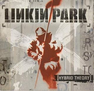
1. Linkin Park - Hybrid Theory
This genre of music is rock/alternative rock and I believe the target audience is 16+. This is because I believe they are targeted by the images shown for example there is an army soldier holding a flag showing battle but at the same time having wings which could symbolise anything from an angel to a butterfly, even a fly. This could link with people who have been in the army and possibly people who have come back as heroes. i.e. the wings.The colour scheme is dark colours showing a strong link to rock music. It also has the band logo and album name in the same font to keep the things similar and looking neat, however they have made it look like its a messy stamp that could be smudged etc. This could count for the whole image as the soldier is faint and the wings are smudged and dripping as if it has just been painted and left. This promotes the band as it gives a powerful thought about their music and the roughness of image shows they are a band of mischief and rebellious.

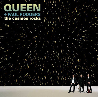
2. Queen + Paul Rogers - The Cosmos Rocks
This genre is once again rock and the target audience is a very wide age range as the band have been round for many years and are very famous, therefore the target audience is round 20-60. They are targeted by the band releasing a new album with another lead singer and also they show the instruments on the CD cover. This gives the audience on the type of music the band creates. The album also has the word 'rock' in the title, therefore allows the audience who enjoy rock know that this album may hold a lot of it.
The iconography is used well to promote the artist as it shows an image of the band with an effective star / explosion image. This shows that the band may have great music which creates an explosion in the fans ipod playlist or CD cupboard. It also shows the bands name so the audience know who's album it is and what past fans will know what the music will be like or what they will be expecting from them.

3. Scissor Sisters - Ta Dah
This genre of music is pop and their target audience is mainly homosexuals but an age range of 16+. They target this audience by making their album cover look like a man is revealing the real him, which is one message from the band which is 'proud to be gay'. This will encourage homosexuals to buy the album. Also, for the different age ranges the image on the cover also has many people in the lift of different gender and age, therefore they may be telling the audience that their music is for everyone.
The iconography of the album cover is that they have used the bands logo in the image of the lift. This is clever as it shows previous fans that just because their is a new alum, doesn't mean the music is any different and the band are still entertaining with a new theme. They have also used good colour scheme as the lift and room seem plan but what all the characters in the lift are wearing, it shows a variety of colours and clothing which really symbolises what the band are really like.

No comments:
Post a Comment