Sunday, 31 October 2010

Bucket Head Logo


This is my final logo design for my music company. I made this logo by using paint and also a website called picnik.com. This allowed me to create the right colours and design patterns to fit the genre of the band we have chosen and to match the music they play. It also made it easy for me to create the image and make it look the best that it could be. I decided to keep a red colour in the logo as it gives a sense of evil in the eyes but the buckets eyes, not the man who's wearing the bucket on their head, therefore it may show an innocent person underneath. This links with the Hollywood Undead band as they all wear masks and they produce mystery for the fans which maybe another thing that is liked by them, therefore they might take interest in the company too because of the similarities.
Bucket Head Productions.com has now got this logo which will hopefully encourage and persuade the public who enjoy alternative rock music to look at more music that the company can offer which gains more fans and overall more money for the company.

Monday, 18 October 2010

Logo Design Evaluation

For the company design I have decided to have Bucket Head as my title and a man wearing a bucket as my logo image. We thought it would be fit for purpose as it reflects the identity of the companies name. Also, It is similar to the band we are working on our music video with as they all wear masks and it shows a bit of mystery to their true identity like the band does. Also the colours fit the genre of music we are working on.
I wouldn't change a lot if I could as I like the logo as it adds a bit of comedy element, links with the genre and band and it is a rememberable image so people will remember our company. I have also put .com on the end of my production as it lets the audience know what the website will be called and notifying them that the company can only be found on the internet.
The target audience is 18 years + so this logo and company name reflects this age group as they enjoy jokes and strange things so it helps them with remembering the logo and company - Bucket Head Productions.com

Mood Board and Website Plans

Here is my mood board and website design and it shows all of my ideas which i might want to include on my website. It also shows all the conventions I have included and gives the audience a good navigation system and easy to understand. This is how I want my website to look.


Introduction to iweb

I used iweb to create a practise site and I used many of the conventions to meet the brief which was the sixth form consortium.
I had a menu bar above that linked to other pages that students or parents may want such as 'news', 'events' and 'blog'. I also provided links to each of the four schools websites individually but it took me a while to add a hyperlink as the internet wasn't working.
I also included widgets such as photos and a countdown for the events page, and I was going to add a clip from youtube of showing some footage produced by one of the schools in the consortium but I couldn't complete this as the internet was down. I added shapes and text to the banner as to make the sixth formers who looked at the site think it was professional and well organised.
I wanted the layout to look good so all people who looked at the site from all ages could use the site and navigate freely and easily.

Monday, 11 October 2010

Website Workings -11/10/10

How did you use your iconography research and web page analysis to inform your homepage design plans?

On my mood board I have put ideas for my banner with the Hollywood sign, but edited it to make it look like the D was falling to make it look not so perfect, then complete it with a decorative Undead font. This shows that the band are rebels and aren't perfect and neither is their music but it is loved by a lot of people and they are passionate about it.
I have also included skulls as their genre has many skulls as the darkness of the music is relevant so in my website design I have also but a skulls head in my banner.
Along with other media conventions I have made my website advertise the bands albums, songs etc which was my main aim. With my logo for the band large at the bottom of the dove and the grenade I feel that this will be a good web page.

Some Music Video Ideas...

Our group brain stormed and come up with some more ideas that we felt would fit our chosen song Paradise Lost.
We firstly thought of a mafia theme in the past which also linked with the 3 blind mice. This included comedy elements and fit well with our songs upbeat rythme. We also wanted it to be a strange narrative video and this fitted it well but once thinking of how we would achieve this and how much it could be we were beginning to think negatively about the idea and then decided to still keep it in mind but carry on brain storming.
We then thought of an idea similar to Fedde Le Grand with his song Put Your Hand Up For Detroit as it involves robotic movement in a narrative way. This brought us to an unnormal world similar to sims which is controlled by one person. Then a rebel breaking free from the controls demanded to them. This also fitted with our genre as indie rock is rebellious with their music. We thought this idea was good and are considering it along with a good narrative story to go with it. It will supply good comedy elements and get our audience interested in the song and most importantly make them remember the video.

Wednesday, 6 October 2010

Audience Profile

We collected all our results from our survey that we asked people to fill out from all ages and areas.
From this we found out that 64% of our genre fans are females, and this has surprised us as we thought that it would of been more males than females.
Out of the 45 that like our music genre they were between the ages of 17-19 with a total of 71.1%.
We also found out that most of these people were students as an occupation and there main hobbies are to do with music as 73.3% said this with 44.4% also saying creative hobbies.
The clothes these 45 people normally wear according to the survey is skinny jeans and light clothes with a joint result of 57.8%.
We also found out that 71.1% of the 45 favourite genre of film is comedy and 82.2% watch music videos on youtube.

Profile

Age: 18
Gender: Female
Occupation: Student

Our typical fan is a full time student at college. She enjoys listening to music as a hobby especially the genre of indie, but sometimes likes to be creative with drawing etc. She enjoys wearing skinny jeans and light coloured clothes. She normally watches her music videos on the internet on youtube.com. Her favourite genre of film is also comedy and her favourite radio station is Kiss 100 fm.

Monday, 4 October 2010

Website Analysis - Hollywood Undead


How are web page conventions used?
Hollywood Undead uses a very big banner and I believe this is good because it allows fans to know that that is their site, it also has information about the latest album which is good as it shows fans what their newest album is and how to buy it. I like this idea as it has a good image of a city and seeing as the band are from Hollywood it links well with the band. I may also do a similar banner for my web page.
They also use a great background of images of the band. This goes along with the layout of the web page as this background stays the same whilst all the web page is being viewed. It shows fans what the band is really like and gives an idea of the bands genre etc.
They also have links to social networking sites so fans can interact with information about the bands on other famous sites they may use such as facebook, twitter etc. They also have a menu bar that links fans to other web pages on the website. I like the way they have done this as they have kept the page organised and made it easy for people to navigate around the site. I will use this on my web page.
They also have media sources on the web page and this is a good thing because it allows fans to know what sort of songs they produce. This can create more fans and more people to subscribe to the site causing the band to get more money. With this in mind I will also use this technique in my web page.
Who is the target audience? How are they targeted?
The target audience for this web page is the fans of the band, mainly male as they do heavy rock. However they can also come under Indie rock, therefore their music may relate to many more. They way it does this is with the colours used on the web page such as blacks, whites, some reds. This is stereotypical of people who like this sort of music.
They are also targeted by the images used on the site, as the background image includes the band with their masks, performing, some girls etc. giving the idea to viewers of what type of band they are. Also looking at their new album cover shows a grenade, and this could relate to people in the war etc, even though the music may not it captures the eyes of a wider range of people.
How successful is it at promoting the artist?
I believe it is very successful at promoting the artist as as soon as a viewer or fan looks at the site it is advertising the new album, and this allows the audience to know that its available to buy now or download without even looking at the rest of the page or site.
Also giving the viewers a chance to listen to the music on the web page will also encourage them to buy the album, even youtube clips that are available on the page will encourage them more to do this.
By the looks of the web page it looks like they are promoting this site and the band on other social network sites. This gets more people knowing about the band and looking at the site, which will end up in some people listening to the songs and buying the album. This includes connecting with the web page from another site i.e. facebook, twitter, myspace etc. so the fans who do so are always in the know about the latest things and happenings of the band, including when a new album comes out.

The Internet as a Promotional Tool

Benefits
  • Wide range of audience
  • Easy to access - can be accessed from anywhere in the world
  • Can be cheaper
  • Can notify a lot of information all in one place
  • Can be a popular place for fans to visit
  • Viral marketing gets round
  • Much more interactive
Drawbacks
  • Over advertising can bring too much traffic
  • Complications can be caused - the internet may have problems, disconnected, crashed etc.
  • Not everyone has the internet - less fans
  • Hackers can enter and destroy the site and mess with information
  • Not everyone knows how to use the internet
  • Lots of adverts from web can distract fans from the site

Glossary

Conventions

Images - To engage the audience, to help the audience identify the web page content.
Text - To inform what the website is about.
Links - To help the audience navigate.
Banner - Eye catching, lets the audience know what the page is.
Logo - To show what the website belongs to and what its about.
Layout - Your audience can navigate the site.

The difference of a web page and website is that a web page is one singe page of information, whereas a website is made up of a number of different web pages connected by links.

Friday, 1 October 2010

Website Analysis


The difference between a website and a web page is that a web page is one single page of information, whereas a website is made up of a number of different web pages connected by links.

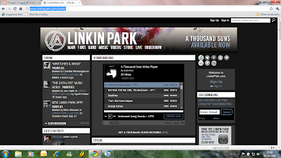
I analysed Linkin Park's home web page and answered these questions about how the conventions were used and what promtional tools were used and how. I chose the Linkin Park web page because I feel that they are near the genre of music we are studying.


1. How are web page conventions used?
The links at the top and side of the web page give navigation to many different pages and sites that are useful to the bands fans, for example their are links to go to social networking sites e.g. facebook, twitter, myspace etc. Another link also takes you to itunes which enables fans to buy some of their records or albums. There is also a link that enables you to return to the home web page if taken to another page. This is useful because it is simple for fans to use and navigates them easily.
Another convention this web page uses is a banner, and this is used well because it lets the site viewers know what the website is about and what current album is available. It also shows viewers what type of band it is as the colours and images in the banner change every time the page is refreshed which gives a specific genre idea - rock.The banner also shows the logo of the band which is an image. This is important for the web page as it alerts fans that it's the official site for the band.
The layout is set out so all different information is in its own area/box. This makes it a lot more organised and easy for fans to see what they want to see. It is also a simpler way to navigate around the site and see a part of the website without even leaving the home page. The information on the home page is mostly about the new album and forums. This allows fans to contact other fans. There is also a 'LP Blog' which means that the band contribute their tour, views and life on the site whenever they want to for their fans to see.
Media is used on the web page as you can here some of their tracks off of their new album. This is good because it encourages fans or viewers to buy the new album or download a song. It is also there to entertain anyone who goes on the site.

2. Who is the target audience? How are they targeted?
The main target audience for the site is for the fans of the band. This is visible because on the homepage it includes the forum which is what the fans use to contact other fans. Therefore when the fans look at this site its one of the first things they see.
Also, it could have a target audience of new fans, and people who haven't heard of the band because they have put a music play on the web page so people can hear their music and see if they like it or not. They also have a link to itunes so them new fans can go straight there and purchase the album/song there.
Lastly, they could also be targeting rock fans as the colour scheme and font etc. gives the impression that that's what they like. Its stereotyping what them sort of fans like.

3. How successful is it at promoting the artist?
I think it is good at promoting the artist as it has lots and lots of information about their new album so it lets fans know that they need to go and buy it which equals more money for them. Also, they include some songs on the web page so new fans can hear them and it will encourage them to buy the new album. The site should also encourage them to join the forum and then they will be in a sort of community with other fans.

Band Ideas